Building the UI
Configuring entries
Selected Entry shows the settings for the active Entry List item. Its subsections change with the entry type. For every field and option, see the Entry type reference.
Basics
Common to most entries:
- Parent: the current parent entry, with a clear button when parented.
- Type: the entry type.
- Editor Label: editor-only list name. It does not affect generated UI labels or custom-property IDs.
- Label / Text / Button Text: the generated UI text (varies by type).
- Description: generated tooltip where supported. Leave it empty for no generated tooltip.
- Property ID: the managed custom-property key (any managed entry type).
Input limits
| Field | Max length |
|---|---|
| Property ID | 63 |
| Label / Editor Label | 255 |
| Tooltip | 512 |
Generated UI tooltip text is additionally clamped for Blender UI safety.
Value / Action
The Value section appears for managed, Custom, and Operator entries:
- Managed entries configure custom-property defaults and UI metadata. This includes the value types — Float, Integer, Boolean, String, Array, Data-Block (ID Type + default), and Python (a Python-literal value).
- Custom entries configure the RNA path or internal control source.
- Operator entries configure operator id, run mode, properties JSON, and notifications.
Copy paths and operators straight from Blender
- Custom path: right-click almost any value, toggle, enum, or colour in Blender → Copy Full Data Path → paste it into the Custom entry; PropUI senses the type.
- Operator id: enable Preferences → Interface → Developer Extras, then right-click an operator → Copy Python Command → paste it into the Operator ID / Call field.
The exact fields per type are in the Entry type reference.
Display
Common display controls (availability depends on type):
- Alert Style: draw the row with Blender alert styling.
- Slider: draw numeric values as sliders where supported. Cannot be active at the same time as Use Soft Limits — turning one on turns the other off.
- Label Layout: One Row or Label Above for scalar numeric controls.
- Multi-Component Layout: layout for arrays and vector/color values.
- Draw Mode: Native Control or Component Fields.
- Component Labels: generated labels for component fields.
- Style: checkbox or toggle button for booleans.
- Icon pickers: pick Blender icons, with a search button beside the field. Icon changes are normal undoable entry edits. Toggle buttons default to no icon.
When Label Above is active you also get:
- Use Text-entry style for the detached label.
- Label Above Style: alignment, alert, before/after icons, and icon hug controls.
Dynamic Labels
Dynamic labels change the visible label/text depending on values — a deep topic with its own page:
Conditions
The Conditions subsection appears only when the active entry has a parent. It controls child availability and visibility based on the parent's value, and includes Copy Conditions tools to reuse those settings on siblings or children. Also covered on the dynamic & conditions page:
Storage
The Storage subsection appears for managed entries:
- Target Override: choose Property Storage (the Output Setup default) or a specific owner target for this entry.
- Override target picker: the same target kinds as Output Setup.
- library_overridable: make the custom property library-overridable where Blender supports it.
Per-entry overrides let one generated panel drive custom properties on multiple data owners. See Property Storage.
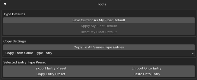
Tools
Per-entry default, preset, and copy actions (the Tools section, shown unless hidden in Editor Layout):
- Save / Apply / Reset My [Type] Default: manage your saved default for that entry type.
- Copy To All Same-Type Entries: copy compatible settings to all peers of the same type.
- Copy From Same-Type Entry: copy from a chosen same-type entry.
- Export / Import / Copy / Paste Entry Preset: move a selected-entry type preset as JSON (file or clipboard).
For Display Links, the tools include:
- Reset to Source Settings: copy compatible display/settings from the linked source.
- Reset to Source Type Default: reset using the linked source entry's type default.