Reference
Entry type reference
Complete option reference for each entry type. For the overview, see the Entry Types concept.
| Type | Creates a managed custom property? |
|---|---|
| Float · Integer · Boolean · String · Array · Data-Block · Python | Yes |
| Display Link · Custom · Text · Operator Button | No |
Slider and Use Soft Limits are mutually exclusive
For any numeric entry that offers both — Float, Integer, and numeric Float/ Integer arrays — Slider and Use Soft Limits cannot be active at the same time. Turning one on turns the other off.
Float
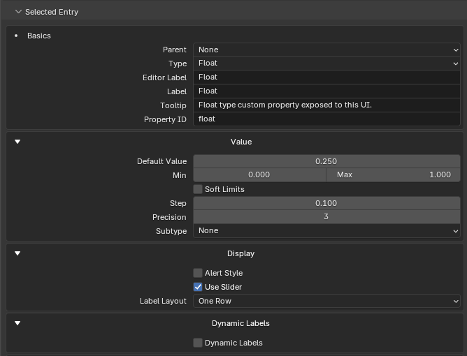
Creates a floating-point managed custom property.
Value settings
| Setting | Description |
|---|---|
| Default Value | Initial/default value when the property is created. |
| Min / Max | Hard bounds. |
| Use Soft Limits | Enables soft min/max fields. Mutually exclusive with Slider (see note above). |
| Soft Min / Soft Max | Soft UI bounds. |
| Step | UI increment. |
| Precision | Visible decimal precision. |
| Subtype | See below. |
Subtypes: None, Pixel, Unsigned, Percentage, Factor, Angle, Time (Scene Relative), Time (Absolute), Distance, Camera Distance, Power, Temperature, Wavelength, Color Temperature, Frequency.
Display settings can include alert style, slider, label layout, dynamic labels, and storage override.
Integer
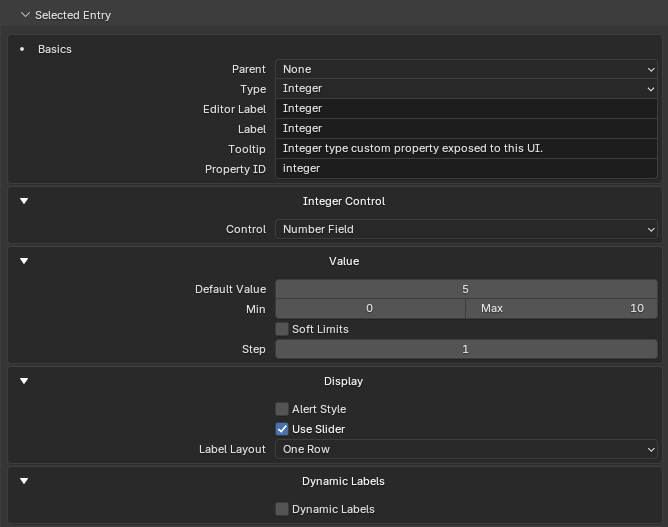
Creates an integer managed custom property. Integers are always stored and drawn as a native numeric custom property.
Value settings: Default Value, Min / Max, Use Soft Limits, Soft Min / Soft Max, Step.
Display settings can include alert style, slider, label layout, dynamic labels, and storage override.
Boolean
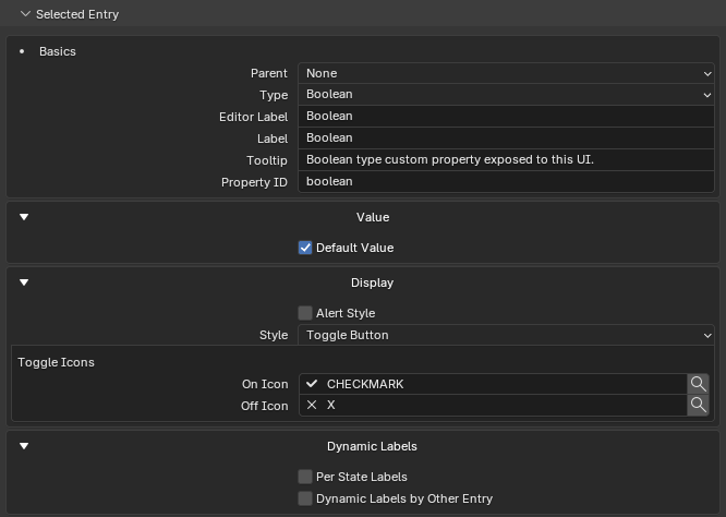
Creates a boolean managed custom property.
Value settings: Default Value (on/off default).
Display settings
| Setting | Description |
|---|---|
| Alert Style | Draw with Blender alert styling. |
| Style | Checkbox or Toggle Button. |
| Toggle Button icons | Separate optional On Icon and Off Icon pickers; the default is no icon. |
| Label Layout | See Scalar label layout. |
| Dynamic Labels | False/true labels, and labels driven by another entry. |
Scalar label layout
Float, Integer, Boolean, String, Data-Block, Python, and compatible Custom scalar values share a Label Layout control that decides where the generated label sits:
| Layout | What it draws |
|---|---|
| One Row | Label and value together in a normal Blender row. |
| One Row, Split Label | Blender's property-split style — the label sits in the left label column and the value in the right value column. |
| Label Above | The label is drawn above the value field, optionally with PropUI text styling (role, alignment, icons, alert). |
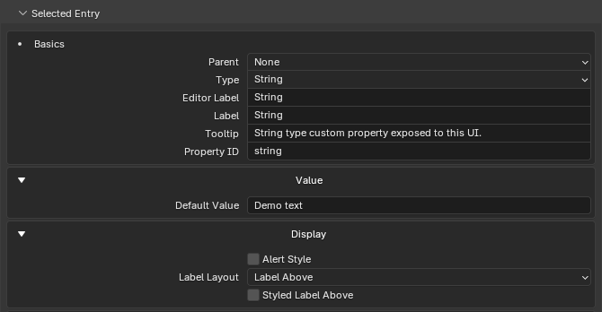
String
Creates a text managed custom property.
Value settings
| Setting | Description |
|---|---|
| Default Value | Initial/default text when the property is created. |
Display settings can include alert style, label layout, Dynamic Labels, and storage override. String Dynamic Labels and child conditions use exact text matching.
Array
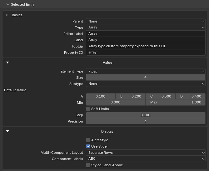
Creates a typed managed array custom property.
Value settings
| Setting | Description |
|---|---|
| Array Element Type | Float, Integer, or Boolean. |
| Array Size | 1 to 32. |
| Subtype | Float arrays only (see below). |
| Default Value | The full array value. |
| Min/Max, soft limits, step, precision | For float/integer arrays where appropriate. |
Float array subtypes: None, Linear Color, Gamma-Corrected Color, Translation, Direction, Velocity, Acceleration, Euler Angles, Quaternion Rotation, Axis-Angle, XYZ.
Display settings for arrays
| Setting | Options |
|---|---|
| Multi-Component Layout | One Row; One Row, Split Label; One Row, Label Above; Separate Rows; Separate Rows, Split Main Label; or Separate Rows, Split Component Labels. |
| Draw Mode | Native Control or Component Fields (when the subtype supports native drawing). |
| Component Labels | Auto, No Labels, Numbered, XYZ, ABC, Greek, Degrees, or Custom. |
| Base | Base label style used by Custom component labels. |
| Per-component overrides | When Custom is selected. |
Color and direction-style arrays may draw as native Blender controls unless Component Fields is chosen or required.
Data-Block
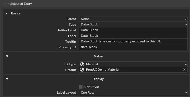
Creates a managed custom property that stores a Blender data-block reference.
Value settings
| Setting | Description |
|---|---|
| ID Type | The accepted Blender data-block type — Object, Material, Image, Collection, Scene, Text, World, and so on. |
| Default | Optional data-block used when the property is created. Leave it empty to create an empty typed slot. |
Generated panels draw Data-Block entries with Blender's native data-block picker. Apply preserves an existing empty value, or an existing value with the matching ID Type; otherwise it restores the configured default or an empty slot.
Display settings can include alert style, label layout, Dynamic Labels by Other Entry, and storage override. Inline labels automatically leave the picker as much of the row as possible while keeping the label readable.
Python
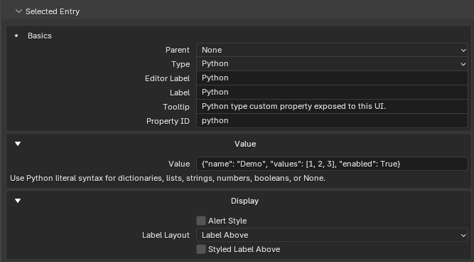
Creates a managed custom property for Python / IDProperty values that don't fit the normal numeric, boolean, string, array, or data-block editors. Dictionaries and nested values are the typical use.
Value settings
| Setting | Description |
|---|---|
| Value | A Python literal expression such as {}, {"mode": "paint", "level": 2}, ["a", "b"], 42, True, or None. |
Generated panels draw Python entries as an Edit Value popup. The popup reads the current value as a Python literal, validates the edited text, and writes it back to the custom property if Blender accepts the value.
Display settings can include alert style, label layout, Dynamic Labels by Other Entry, and storage override. Python entries don't use self-driven Dynamic Labels because nested Python values have no single predictable comparison value.
Trust note
Python-value editing is meant for trusted project data. PropUI validates with
Python literal syntax, but the generated panel itself is still Python code
inside the .blend — the same trust boundary as Blender Text scripts,
drivers, and add-ons.
Display Link
Draws an existing managed PropUI entry (or a supported Custom entry) again. It does not create a new custom property.
Basics
| Setting | Description |
|---|---|
| Linked Entry | The source entry to draw. |
| Label | Source Entry or Custom. |
| Custom Label | Used when Label is Custom; empty draws no label. |
| Tooltip | Source Entry or Custom. |
| Custom Tooltip | Used when Tooltip is Custom. |
A Display Link can have independent display settings, dynamic labels, child conditions, and Generated Layout placement, while sharing the source value.
Multi-component sources
- Component Subset: draw only chosen components/channels.
- Component Subset list: each row chooses a 1-based component, with Add/Remove/Move controls.
Edge cases
- If no valid source is chosen, PropUI warns and hides source-dependent controls.
- Sources can be any managed entry (Float, Integer, Boolean, String, Array, Data-Block, Python) or a supported Custom entry.
- Component subset controls only appear for supported multi-component sources.
Custom
Draws an existing Blender RNA property, or an internal generated-UI control. No managed storage is created.
Grab an RNA path from Blender — no typing
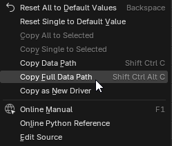
You don't have to write paths by hand. In Blender, right-click almost anything that stores a value — a slider, toggle, enum, color, or number field — and choose Copy Full Data Path (Shift+Ctrl+Alt+C). Paste it into the Custom Path field, and PropUI senses the value kind automatically.
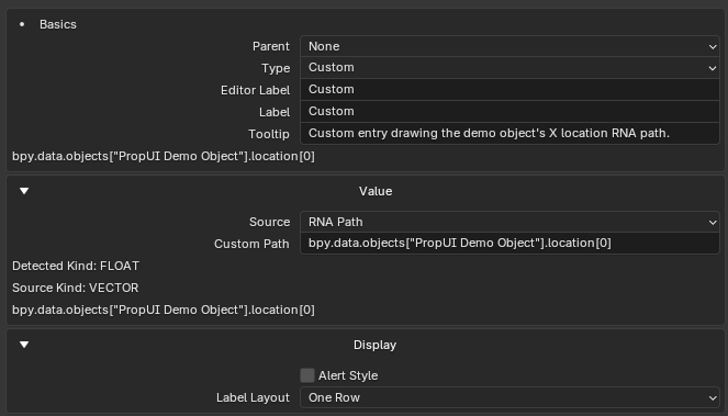
Source modes: RNA Path, or Internal Generated UI Control.
RNA Path settings
| Setting | Description |
|---|---|
| Custom Path | A full Blender Python/RNA path to a property. |
| Detected Kind | The value kind PropUI detected. |
| Source Kind | May appear when using one component of a larger value. |
| Inline errors | When the path cannot be resolved or drawn. |
Sensed value kinds. Custom detects the kind of value at the path and draws it accordingly: Bool, Int, Float, String, Enum (native RNA enum), Data-Block (ID pointer), Pointer (non-ID RNA pointer, drawn as a summary), Collection (read-only summary), Vector, Color (float array with a color subtype), Int Array, Bool Array, and Python/IDProperty data. For multi-component values (Vector, Color, Int/Bool Array), component indexing lets one Custom entry draw or compare a single component.
Path format. Custom paths are Blender data paths, not Python expressions.
They must start with bpy. and use attribute access plus literal ["name"] /
[index] lookups:
bpy.data.objects["Cube"].parent
bpy.data.objects["Cube"].modifiers
bpy.data.objects["Cube"]["custom_vector"][2]
Method calls, operators, math, and conditionals aren't paths — put that behavior in an Operator Button instead.
Internal controls
| Setting | Description |
|---|---|
| Generated UI Enabled | Show or hide this generated UI. |
| Disable While Transforming | Disable during transforms. |
| Disable While Playback | Disable during animation playback. |
| Default Value | Default state for the internal boolean control. |
Text
Draws non-interactive generated content. No managed storage.
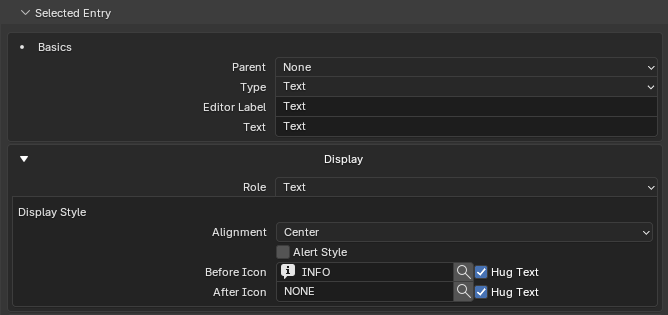
Roles: Text (a label row), Divider (a divider line), Spacer (empty space).
Display style
| Setting | Options |
|---|---|
| Alignment | Left, Center, Right. |
| Alert Style | Blender alert styling. |
| Before Icon | Optional icon before the text. |
| Hug Text (before) | Keep the before icon attached to the text. |
| After Icon | Optional icon after the text. |
| Hug Text (after) | Keep the after icon attached to the text. |
Dynamic Text can replace text based on other entries, and can optionally override the role, icons, alignment, and alert styling per rule.
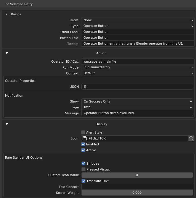
Operator Button
Draws a button that runs any Blender operator by id — including operators from enabled third-party add-ons. No managed storage.
Grab an operator id from Blender — no typing
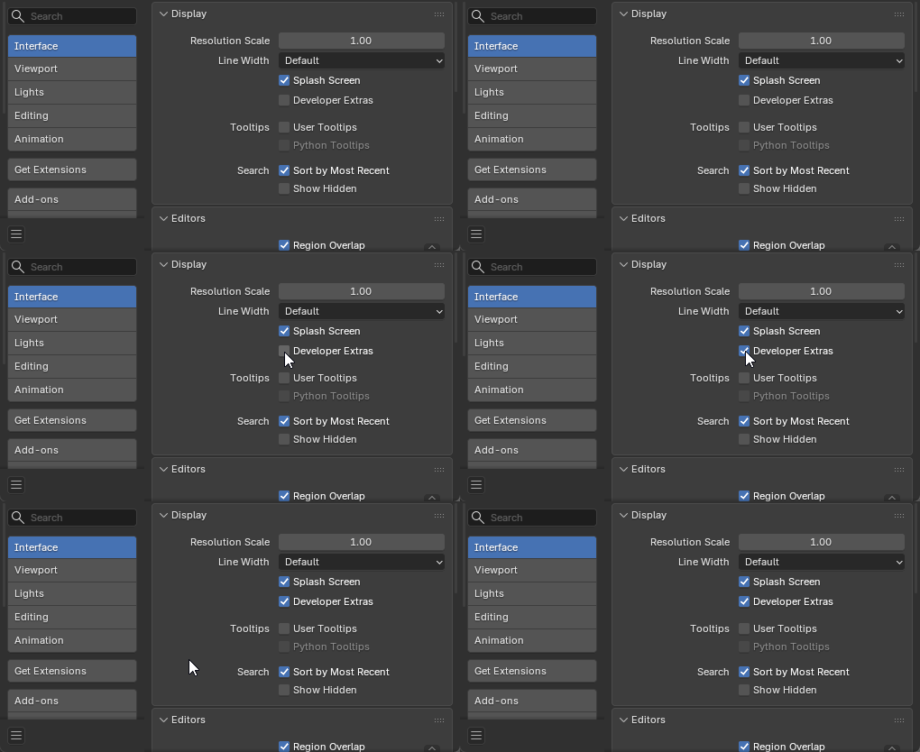
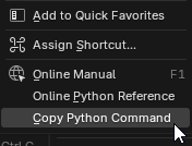
First enable Edit → Preferences → Interface → Developer Extras. Then right-click the button or menu item for the operator you want and choose Copy Python Command. Paste the result straight into the Operator ID / Call field below — PropUI parses the operator id and any supported keyword arguments from it.
Basics: Button Text, Description (tooltip).
Action settings
| Setting | Description |
|---|---|
| Operator ID / Call | An operator id like object.select_all, or a bpy.ops...(...) call. PropUI can parse supported keyword args from a call. |
| Run Mode | Run Immediately, or Interactive / Popup. |
| Context | Advanced context scope when enabled. |
| Operator Properties (JSON) | JSON object of operator keyword arguments. |
| Parse errors | Appear inline for invalid operator properties. |
Notification settings
| Setting | Options |
|---|---|
| Show | No Notification, Always After Click, On Success Only, On Failure Only. |
| Type | Info, Warning, Error. |
| Message | The report message. |
Display settings: Alert Style, Icon, operator_enabled, operator_active,
plus rare Blender UI options (emboss, depress, icon value, translate, text
context, search weight).