Get started
Example: color display toggle
This example builds a clean toggle-based color control. The final panel lets the user switch between a native color picker and separate Red, Green, Blue, and Alpha rows — and both edit the same color value.
The trick: only one display mode is visible at a time, and the native picker is sized to take the same space as the four component rows, so switching feels seamless with no panel jump.
What you'll use
A Boolean parent, a color Array (or Custom RNA path), a Display Link, and parent/child conditions. This is a Full edition example.
1. Add the boolean toggle
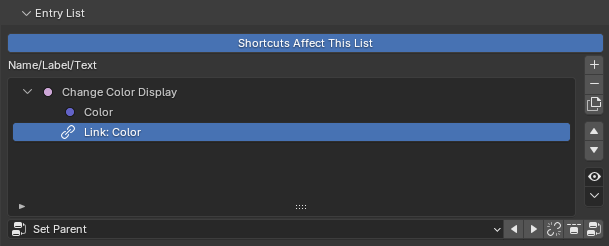
In the Entry List, add a Boolean entry — it controls which version of the color UI is shown.
- Label:
Change Color Display - Description: explain that this toggle changes how the color is displayed.
- Icons: set the off icon to a color-style icon and the on icon to an alternate display icon, so the toggle reads clearly in both states.
This boolean is the parent switch for the rest of the example.
2. Add the color value
Add the actual color property, either as:
- an Array entry (a float array), or
- a Custom entry pointing at an array RNA data path.
Set this entry to the Native Control draw mode. For a color array, the native control is Blender's built-in color picker — the compact view.
This entry holds the real color value the user edits.
3. Add a Display Link
Add a Display Link entry and link it to the color entry from step 2.
A Display Link doesn't create a new value — it draws the same color a different way. Set its Multi-Component Layout to Separate Rows, so the color appears as four individual rows: R, G, B, A.
4. Parent both color displays to the boolean
Make the boolean the parent of both the color entry and the Display Link, so they're its two children:
5. Set the Display Link's condition
Open the Display Link's conditions and set Child Visibility so it shows only when the parent boolean is on.
→ When Change Color Display is on, the separate R/G/B/A rows appear.
6. Set the color picker's condition
Open the color entry's conditions and set Child Visibility so it shows only when the parent boolean is off.
→ When Change Color Display is off, the native color picker appears.
Now the boolean controls which view of the same color value is visible.
7. Import the entries into the Generated Layout
Import all three entries into the Generated Layout, with the Display Link directly below the color entry:
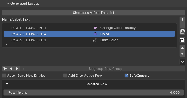
The order matters: when the color picker hides, the Display Link takes its place in the same spot.
8. Match the row height
The native color picker uses one row, but the Display Link (Separate Rows) uses four — R, G, B, and A. To make the swap seamless, set the color entry's Row Height to 4 so it occupies the same vertical space as the four component rows.
Now toggling the boolean changes the display mode without the panel resizing.
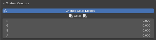
Final behavior
- Off → one large native color picker.
- On → four separate R/G/B/A component rows.
- Both edit the same color value.
It's a clean demonstration of using PropUI to build alternate interfaces for one property while keeping the generated panel tidy. From here, explore dynamic labels & conditions for more reactive UI.