🖥️ Generated Output
How the generated rig UI is assembled from your authored entries, and how display labels are resolved at runtime.
Generated Rig Output Behavior
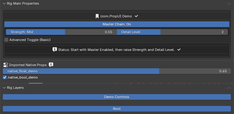
A generated rig example showing managed properties, text rows, and imported native properties in the final UI.
Managed entries are generated from runtime layout entries. FLOAT, INT, and BOOL entries create real custom properties, while TEXT entries draw UI only.
Native passthrough section renders unmanaged native props when overwrite-native mode is off and showing them is enabled.
Section order is managed then native by default, but native can be drawn above managed if configured. Both sections support optional, styleable headings that can wrap the section in a box.
Visibility and availability in the generated UI
Entries with matching availability rules stay visible but are disabled (grayed out). Entries with matching visibility rules are shown or hidden entirely.
In shared rows, hidden entries either collapse and re-pack or reserve an empty slot, depending on the entry's shared-row hidden mode.
Generated output behavior on the final rig UI.
Display-Label Semantics
Dynamic labels change the text shown in the Rig UI at runtime. Here is a summary of how each system resolves:
- FLOAT / INT value-bucket thresholds are inclusive — the highest matching threshold wins.
- At Least / At Most parent checks are inclusive.
- Range checks are inclusive.
- Dynamic labels change displayed text; tooltips remain static.
For the full comparison semantics table for parent visibility and availability rules, see Child Visibility Rules.
Condition expressions
Boolean parent visibility / availability:
- When Parent Is On =>
parentis truthy - When Parent Is Off =>
not parent
Numeric parent visibility / availability (FLOAT / INT):
| Mode | Expression |
|---|---|
| EQUAL | == |
| GREATER_EQ / At Least | >= |
| LESS_EQ / At Most | <= |
| RANGE | low <= value <= high |